Creek 2 Coast
Paddlesports
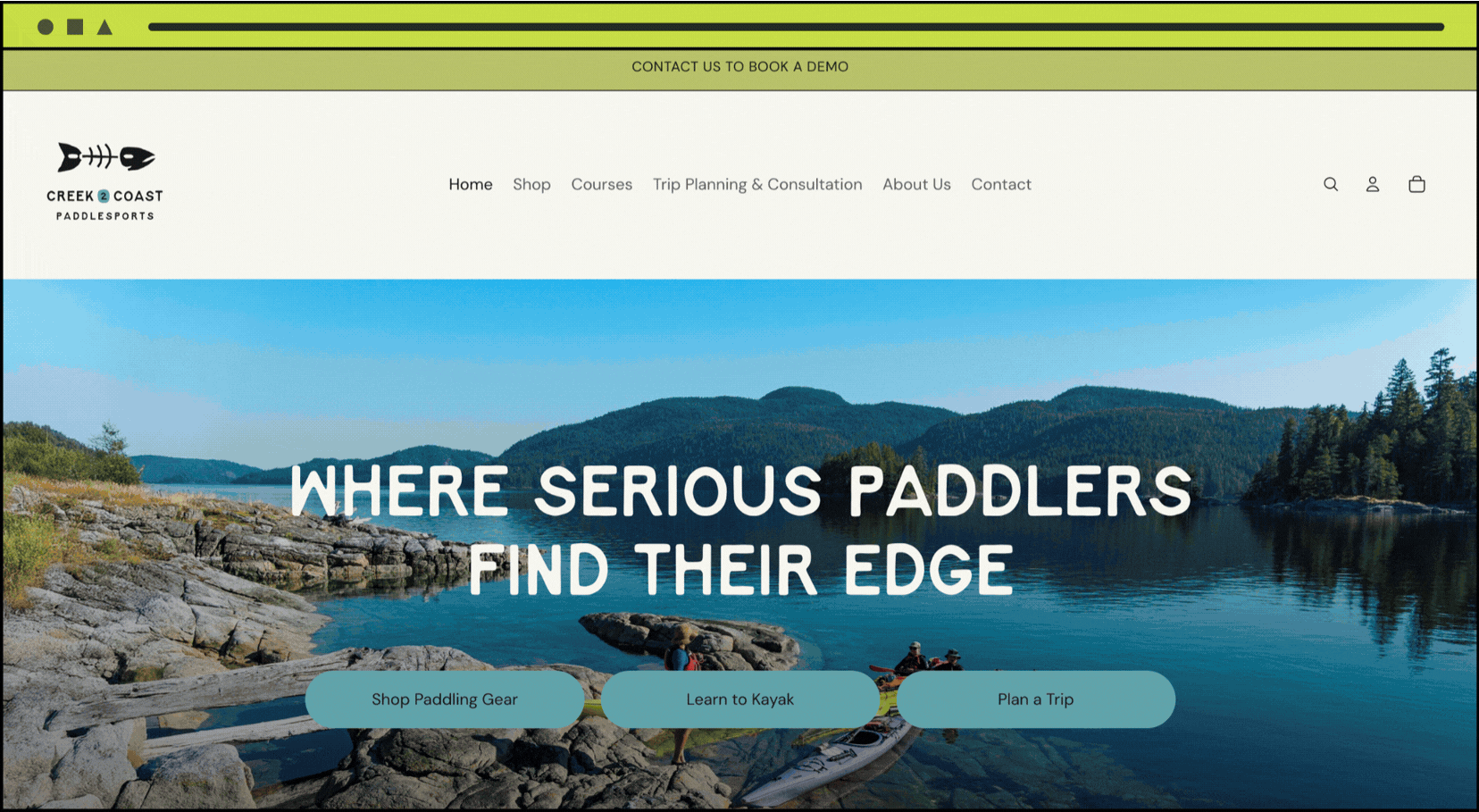
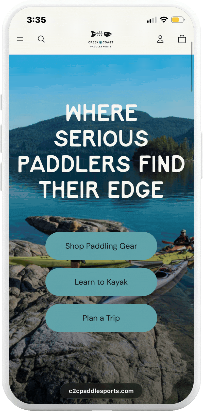
Creek2Coast Paddlesports (C2C) offers a diverse range of kayaking products and experiences for paddlers at all levels. C2C needed a brand and website design that aligned with their mission and values.
C2C believes time on the water has the power to transform our mental health, build resilience, and help us appreciate the power and beauty of Mother Nature.
Their new visual identity and website helps them communicate this message and meet paddlers where ever they’re at.
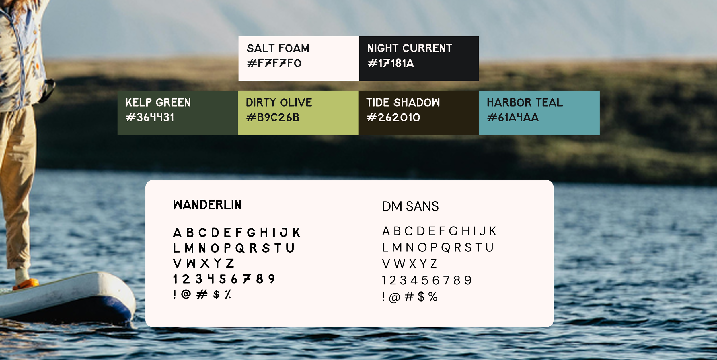
Colour Palette And Typography
To communicate what C2C does, we used a water-inspired colour palette and fonts that feel like they belong outdoors.
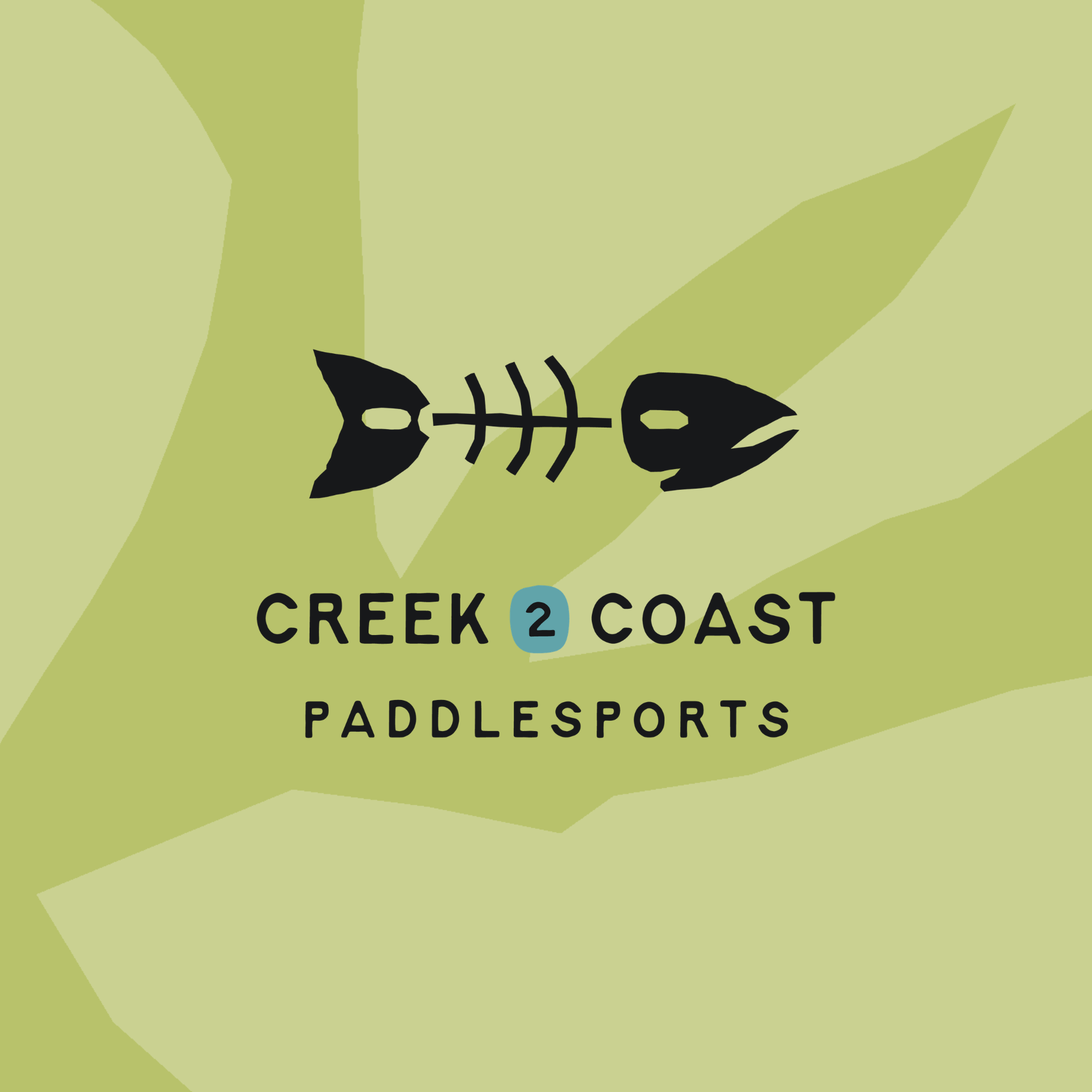
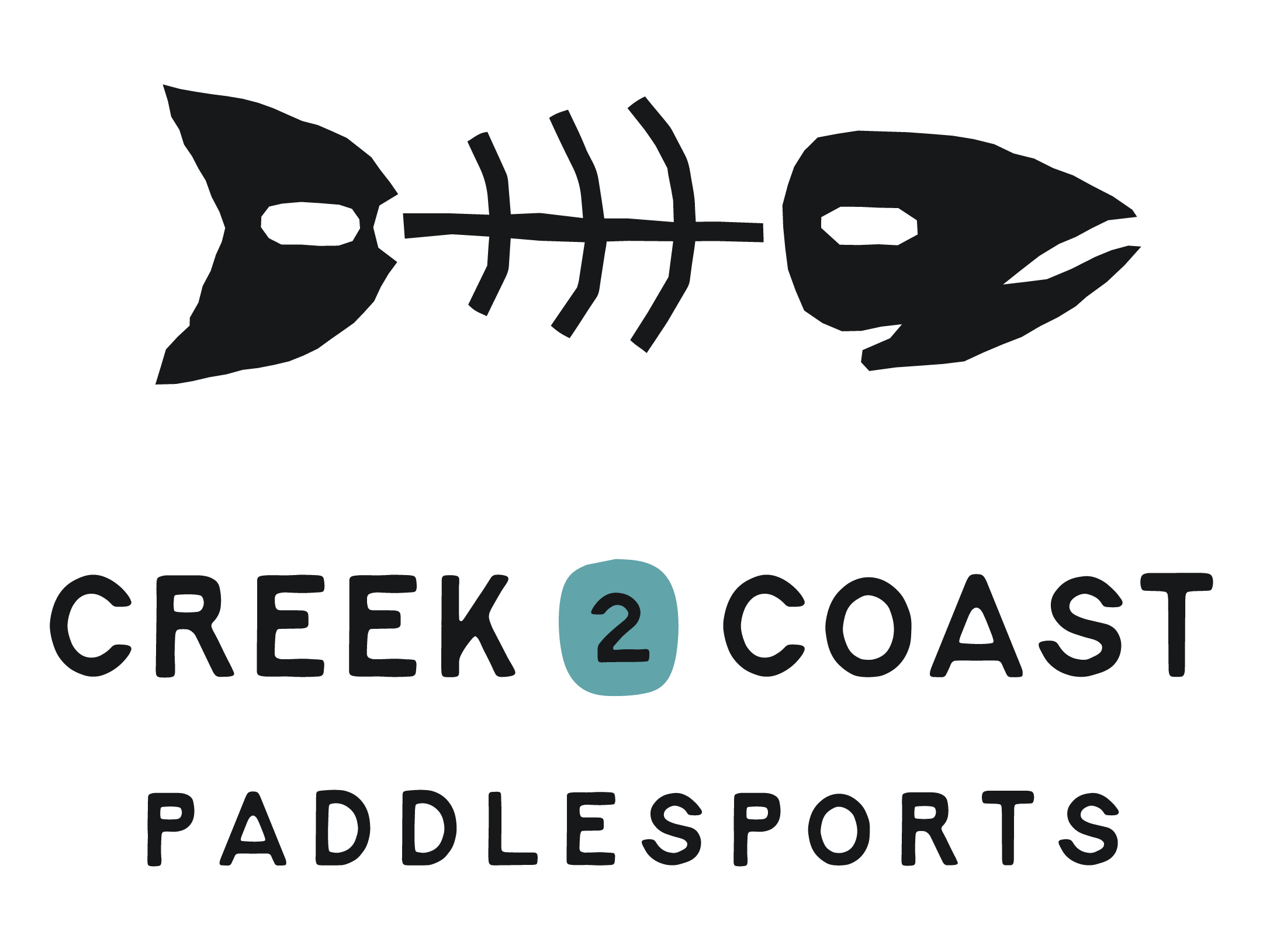
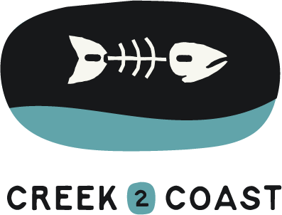
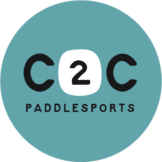
Logo Suite
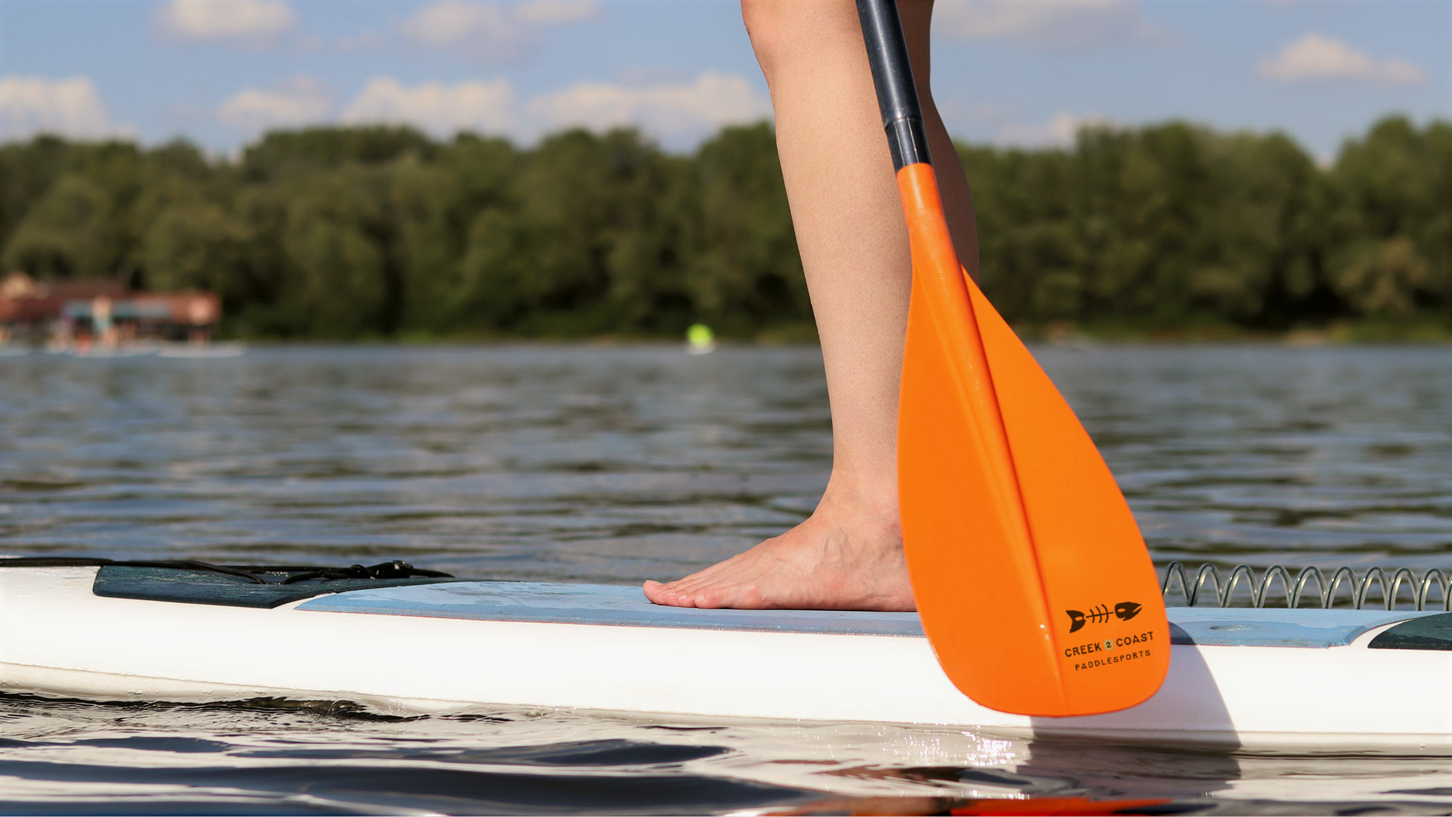
Brand In Action