
WellMind Counselling Brand Refresh
I had the pleasure of doing a brand refresh for WellMind Counselling. WellMind Counselling is owned and operated by Cecile Tucker. Cecile has built everything at WellMind on her own, from her website, clientele, to her active social media following on Instagram and TikTok. All of this has helped WellMind flourish into a respected counselling agency in Kamloops!
With 5 therapists currently working at WellMind, Cecile has plans to expand her business offerings and bring more counsellors on with diverse backgrounds. As well, looking at offering additional educational trainings to other therapists and businesses.
Colour Palette And Typography
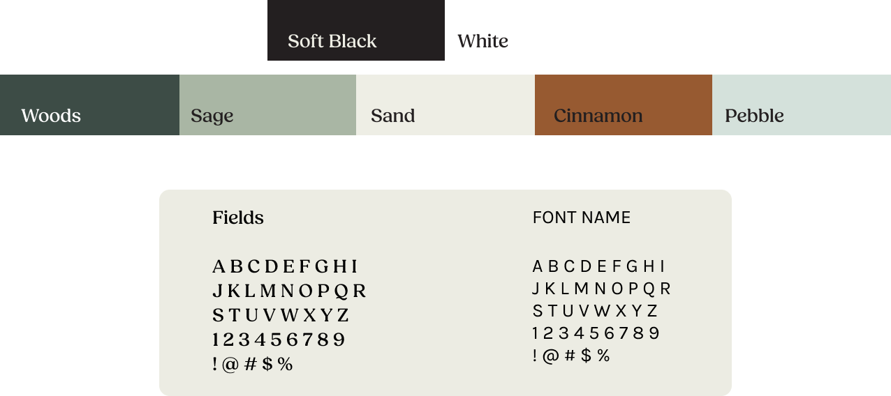
WellMind Counselling wanted their branding to feel comforting and professional. Earthy and muted colours, paired with clean serif and sans-serif fonts balance the feelings of safety and comfort alongside authority in their practice.
Logo Suite


Icons & Buttons
Consistent icon styles support brand cohesion without competing with text.

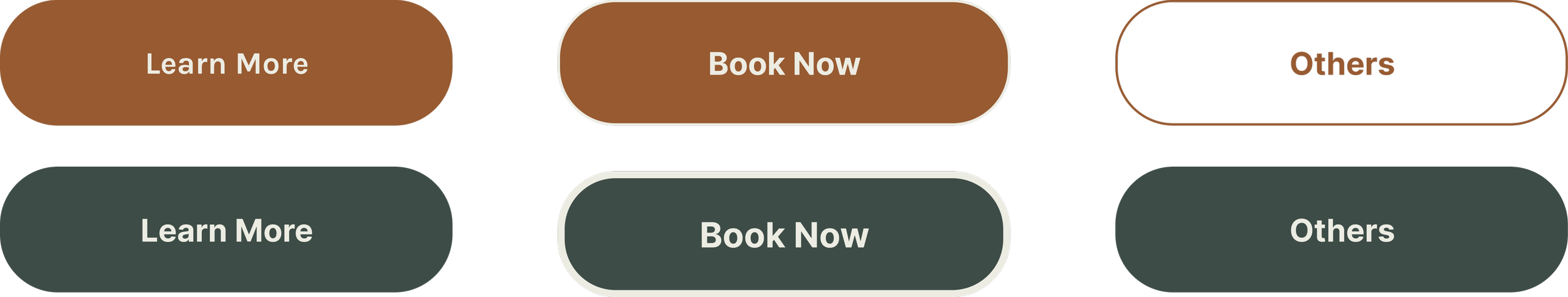
When icons and buttons are paired with a structured layout, they reduce cognitive load and prevent content from feeling overwhelming.
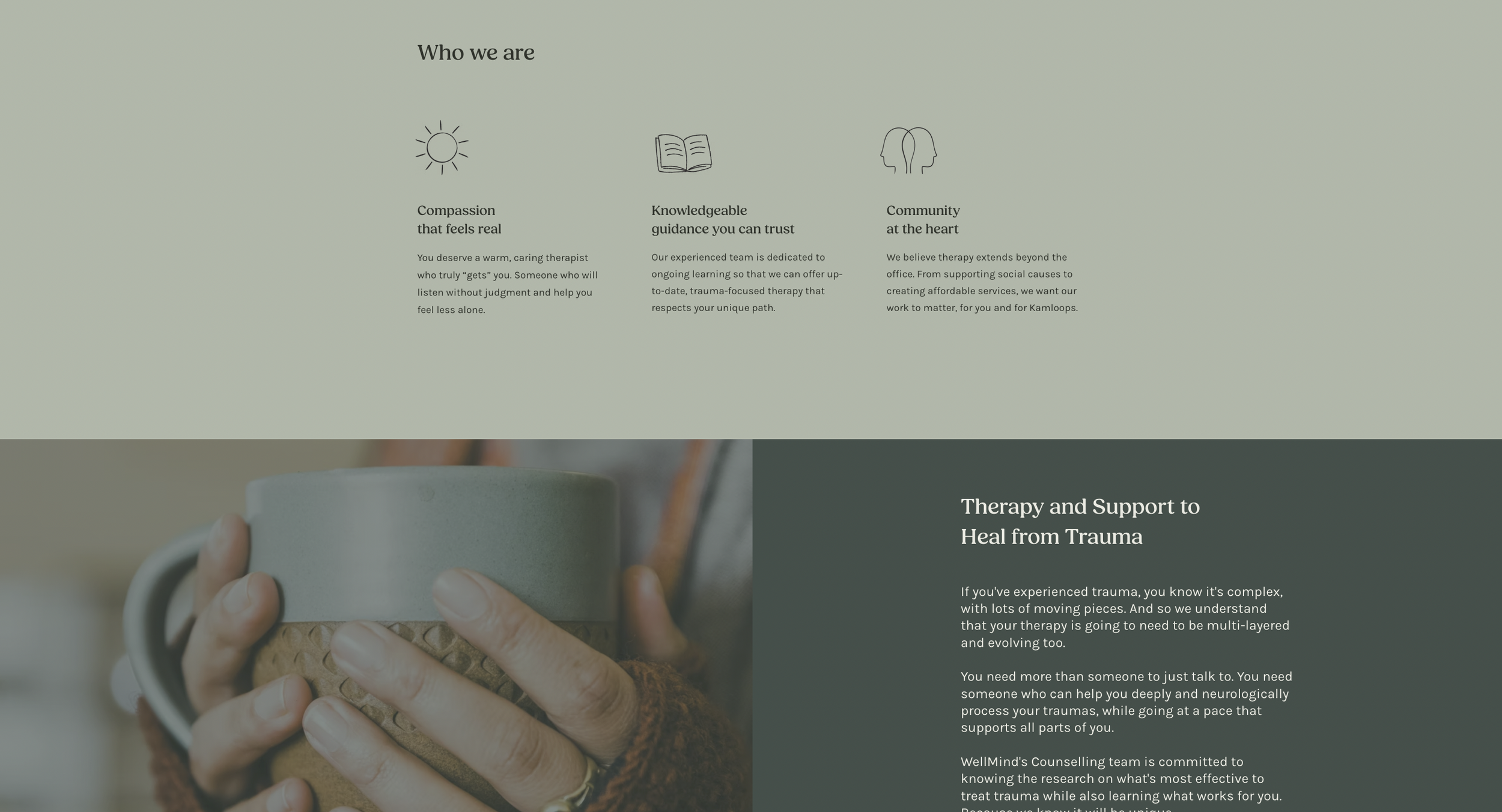
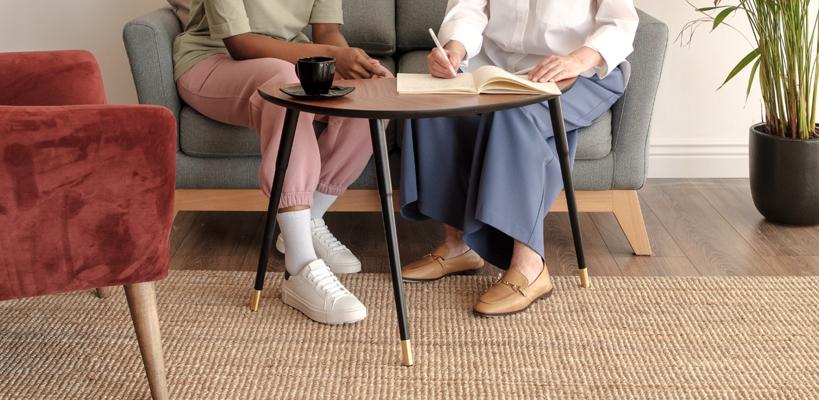
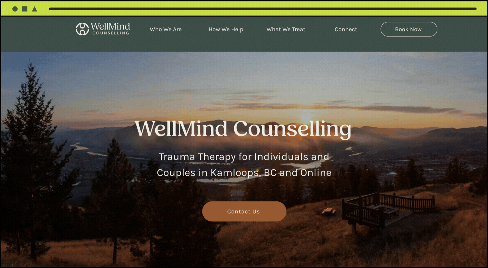
Brand in Action
View Client’s Live Site Here
Impactful Changes
These are the changes we made during WellMind’s brand refresh:
Strategic font sizing and spacing that help guide the reader’s eye. This makes key information easier to identify at a glance.
Reworked the website menu with their dark green brand colour to provide more contrast, which increases readability.
Adding a book now button to ease booking accessibility and increase their click through rate.
What is it like working with me?
Watch our testimonial and process video below where Cecile discusses what it’s like working with MAD Creative, and I talk about my vision behind WellMind’s new logo!